Art Fitzpatrick and Van Kaufman
Legendary Pontiac Illustrator Art Fitzpatrick describes his career up to and including his famous work with Van Kaufman.
What designer doesn’t have a collection of Pontiac brochures from the ’60s? I do.
The video has provided an opportunity to post two articles about Art Fitzpatrick that I’ve kept in reserve for just such a time as this.
The book, Art Fitzpatrick & Van Kaufman, Masters of the Art of Automotive Advertising, is available through https://www.fitzandvan.com/ and Amazon.
—Thanks to Bob Ackerman
Art for Art’s Sake
Written by Art Fitzpatrick on June 12, 2013 Classic Pontiacs Elevated to a Pure Art
http://www.hotrod.com/features/history/stories/1306-art-for-arts-sake-pontiac-lives-on/
If you are of a certain age, you will remember the exciting and expertly illustrated wide-track Pontiac advertisements that decorated the pages of Life, Look, Harper’s, The Saturday Evening Post, Sports Illustrated, and Esquire magazines. From the mid ’20s through the early ’70s, every major car manufacturer marketed its wares through artistically appealing and expertly drawn four-color magazine ads.
Although Pontiac Motor Division is no longer with us, its chief artist of 13 years, Art Fitzpatrick, thankfully is. Art inherited his artistic talent from his grandfather, F.W. Fitzpatrick, a noted architect and illustrator, and his father, commercial artist Arthur Fitzpatrick Senior, who among other accomplishments painted watercolor backgrounds for Walt Disney.
“Walt Disney once said that my father was the only man he knew who could paint air,” says Art.
Art studied architectural and mechanical drawing in high school but dropped out at age 16. His next stop was Detroit’s Society of Arts and Crafts, after which he went to the Detroit School of Art while working the night shift at Chrysler Engineering retouching photo prints and engineering drawings. In 1937, at age 18, Art apprenticed under noted car designer John Tjaarda (known for his work on the Lincoln Zephyr, among other streamlined efforts) prior to moving to Hollywood with his parents in 1938. On the West Coast, Art secured a job with famed designer “Dutch” Darrin, helping build custom one-offs for Hollywood stars like Errol Flynn, Clark Gable, and Al Jolson. After returning to Detroit, Art worked with Werner Gubitz on the Packard Clipper design project. By age 21, Art was a consulting designer to General Electric.
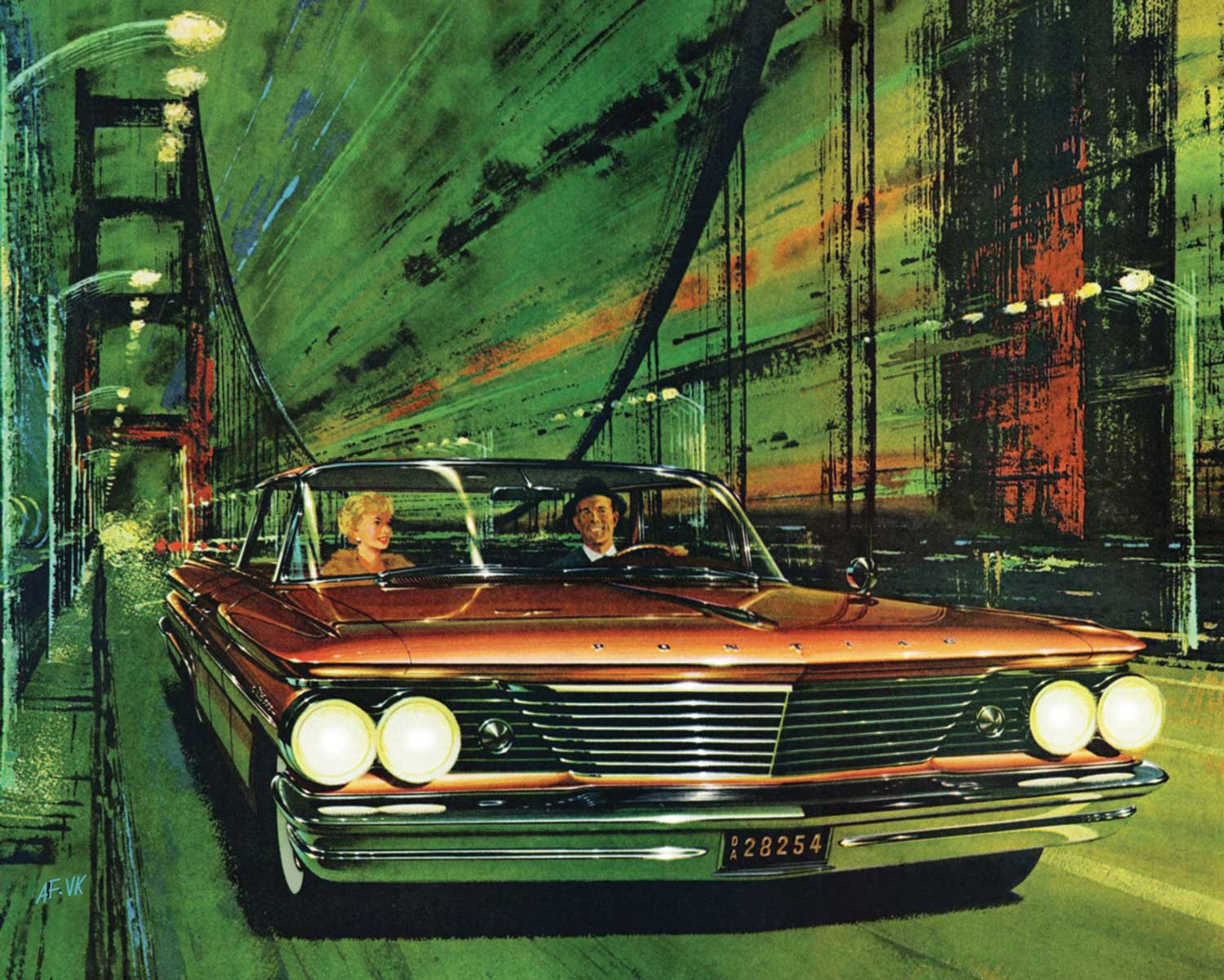
Fitz and longtime collaborator/background artist Van Kaufman were the first to introduce the strobe-light effect into automobile advertising art with this ’60 Pontiac Catalina illustration titled Copper Strobe.
Following service in the Navy in World War II, Fitz, as he was called, freelanced for numerous ad agencies, drawing advertising art for Mercury, Lincoln, Nash, Chrysler, Dodge, Plymouth, Studebaker, and Kaiser. In 1950, he hired background artist Van Kaufman to work on the Mercury account. The two worked as a team for 21 years.
“Every major car manufacturer marketed their wares through expertly drawn magazine ads”
In 1953, GM’s Buick Division signed Art to an exclusive services contract that began his 21-year association with General Motors on the Buick, Pontiac, and Opel accounts. The General Motors Golden Anniversary Book, designed and produced by Fitzpatrick and Kaufman, opened the door to a 13-year association (1959-1972) with Pontiac Division.
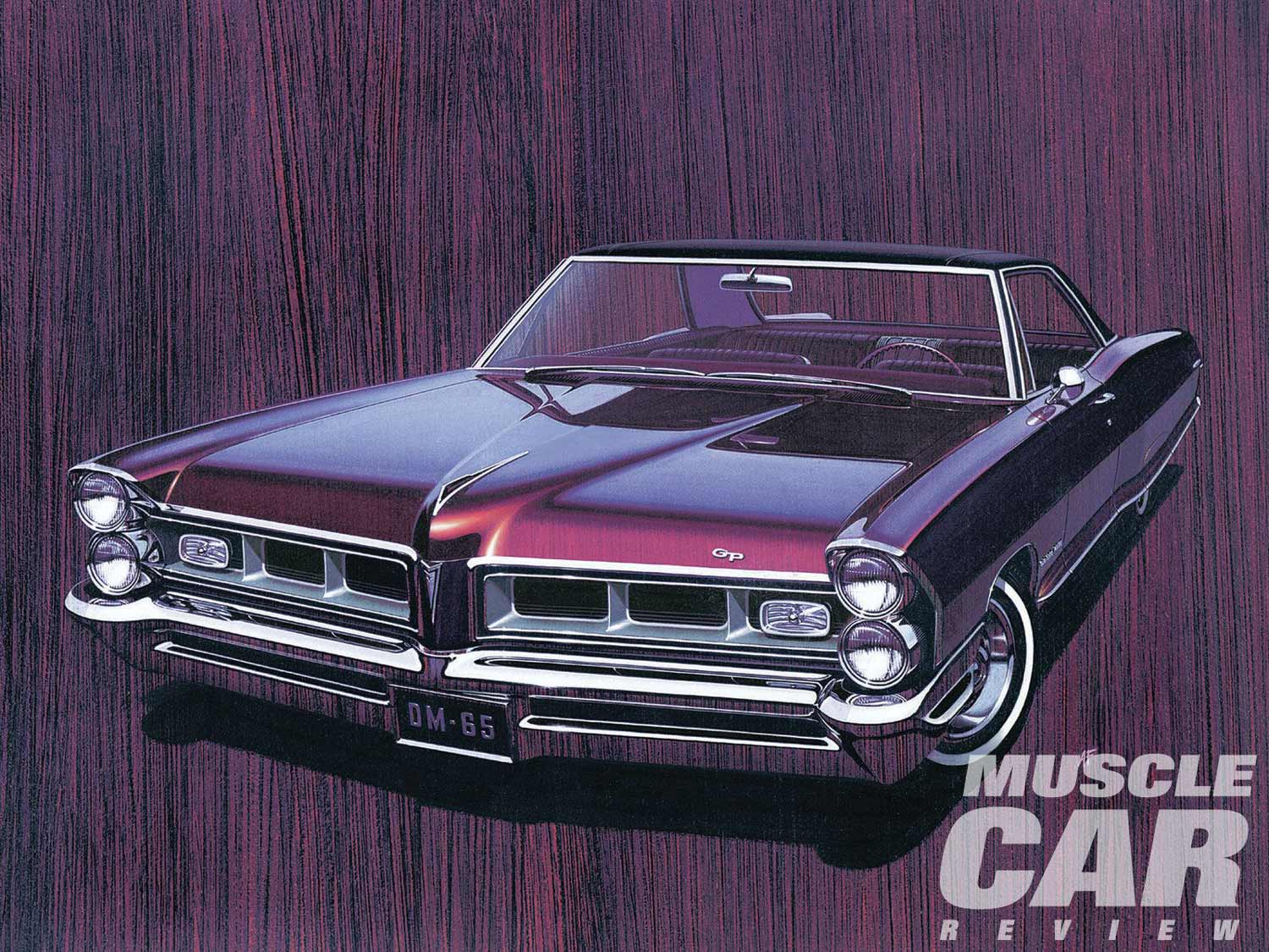
Fitzpatrick’s greatest achievement was receiving the first national Andy Award (the advertising industry’s equivalent of the Oscar) in 1964 by the Advertising Club of New York City. He won for the best consumer ad-color magazine advertisement for the ’65 Pontiac Grand Prix announcement. Yet the trophy was given not to Fitzpatrick but rather to the ad agency of record, McManus, John & Adam. However, Better Classics’ Larry Anthony recently located one of these awards on eBay, had it restored, and presented it to Art last year during a ceremony at the Automotive Driving Museum.
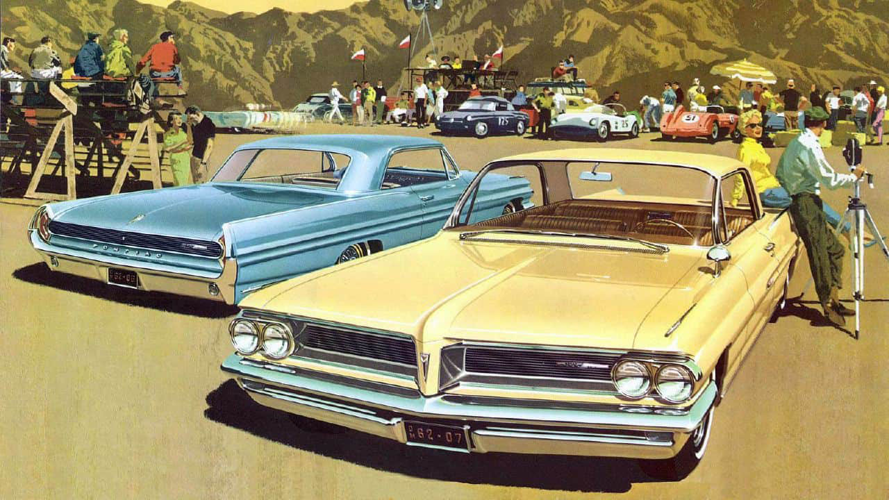
The Pontiac ad campaign that was to follow, consisting of more than 285 paintings, helped to dramatically improve the automaker’s sales standings, from Seventh to Third Place in less than two years—a position Pontiac would hold for 13 years. The campaign is testimony to the visual power and impact created by Fitzpatrick and Kaufman’s body of automotive art.
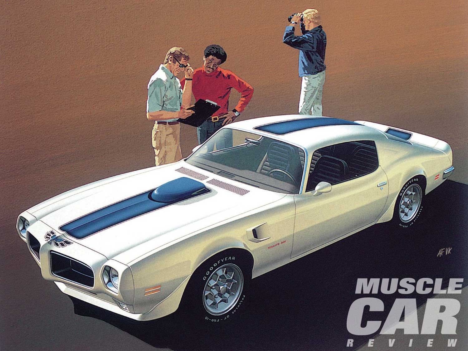
Fitz employed an interesting technique to accentuate the Pontiac’s distinctive wide-track look. He would trace over a photo of the new car, then cut the tracing into pieces that he then stretched to dramatic effect.
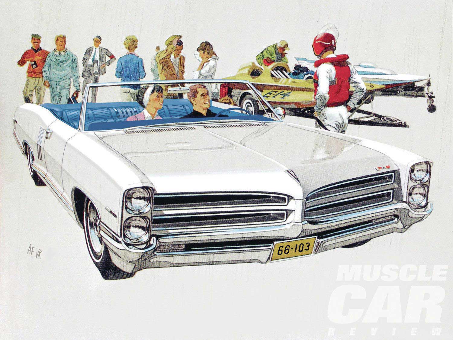
Sometimes less is better. Boat Racer’s II features a ’66 Pontiac 2+2 with a minimal watercolor background for maximized effect.
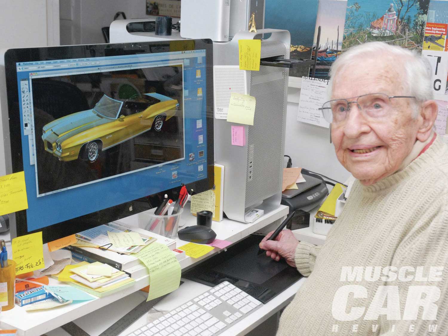
Other post-Pontiac assignments have included the 2005 USPS commemorative stamp series “America on the Move,” and the 2008 commemorative stamp series “50’s Fins & Chrome,” the latter winning the Gold Creativity Award for Illustration. Fitzpatrick was also given a screen credit for consulting with Pixar Studios on its Oscar-nominated film Cars.
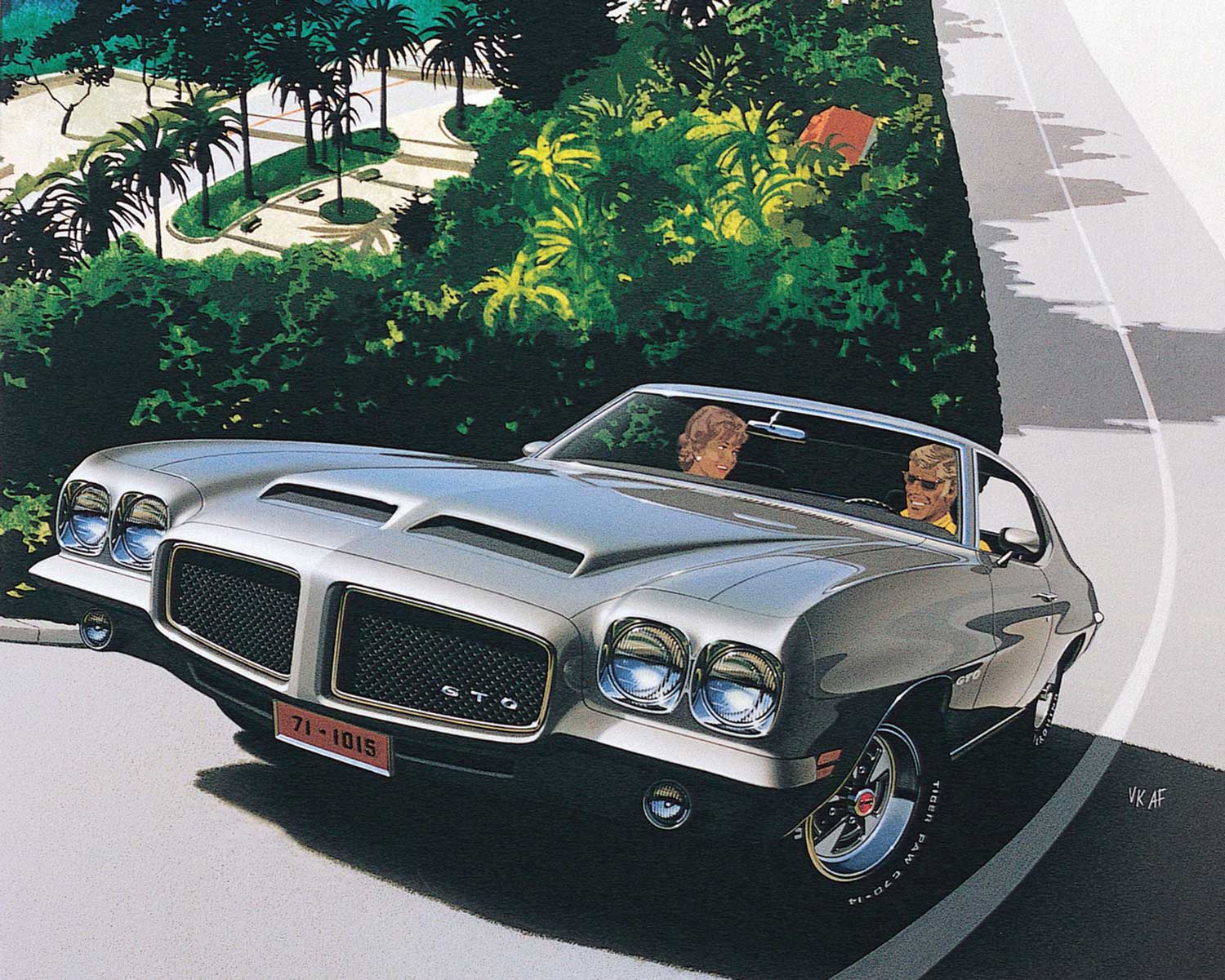
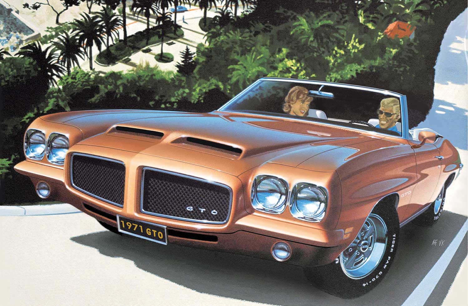
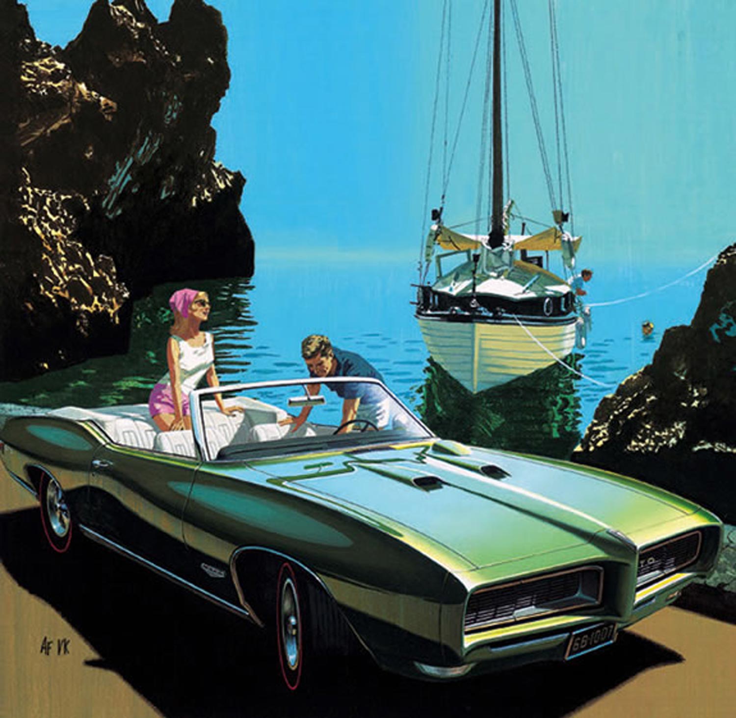
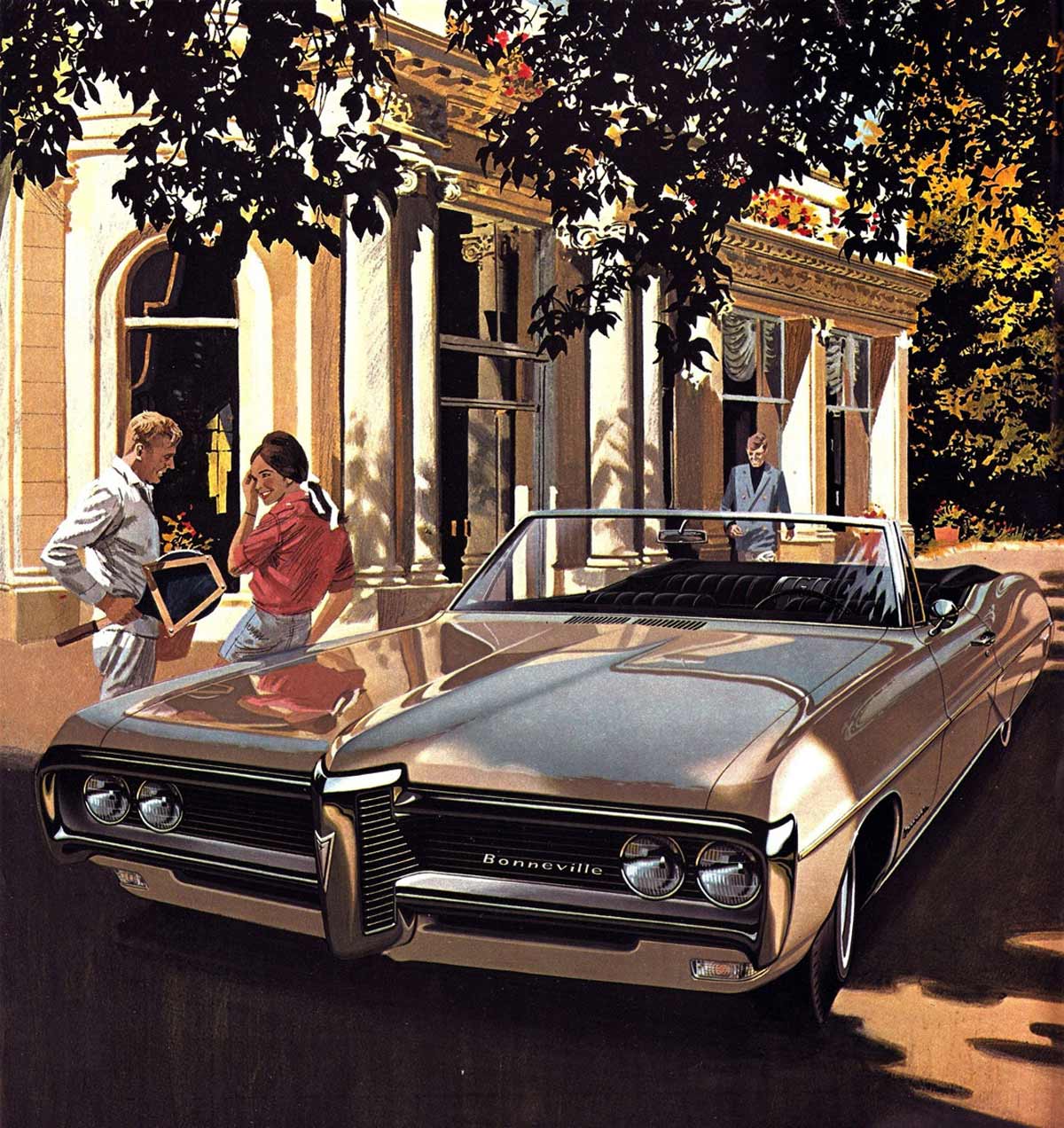
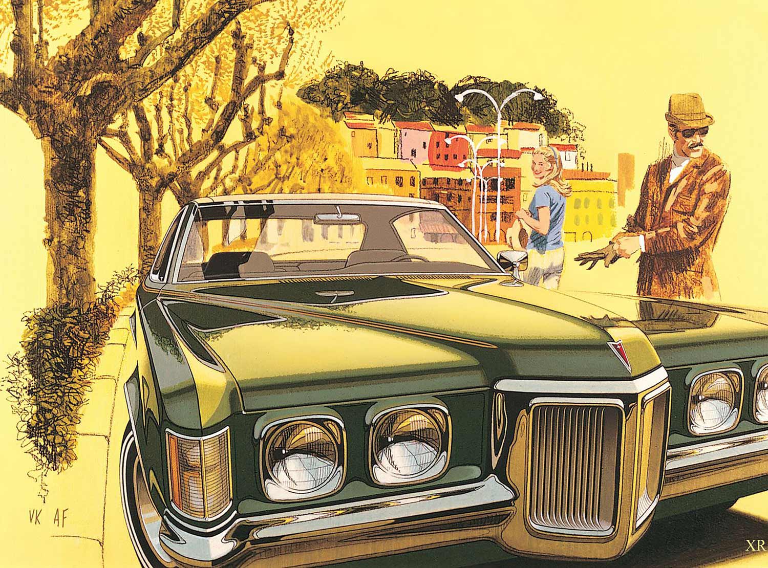
Road to Eze is one of many Fitzpatrick/Kaufman paintings that make use of actual photographs taken by the artists during their extensive (yet separate) world travels. Note there are two versions of the painting, one featuring a ’71 GTO hardtop and the other a convertible.
The winner of more than 50 awards, including the 2012 Lifetime Achievement Award in Recognition of Outstanding Contribution to the Art of the Automobile from the Art Center College of Design, Art is currently putting the finishing touches on an award bearing his name, the Art Fitzpatrick Award, the Art of the Automobile That Stirs the Soul, to be given annually by the Automotive Fine Arts Society at the Pebble Beach Concours d’ Elegance.
Those who wish to view Art’s body of work at length or order examples of his work can contact him at fitz-art.com.
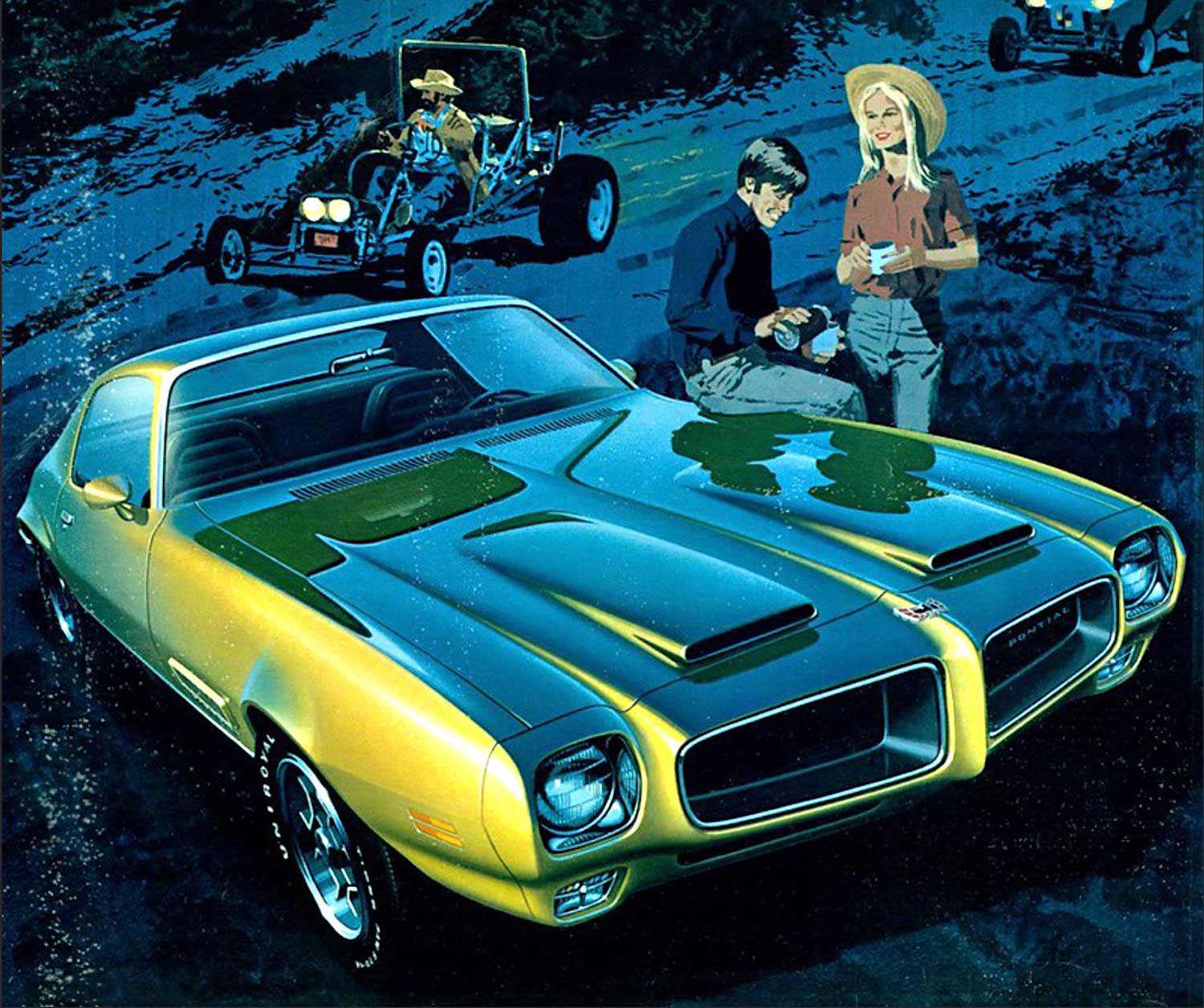
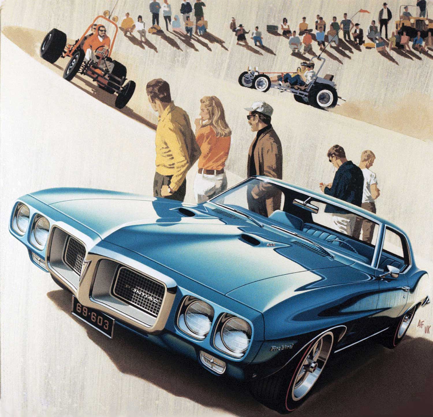
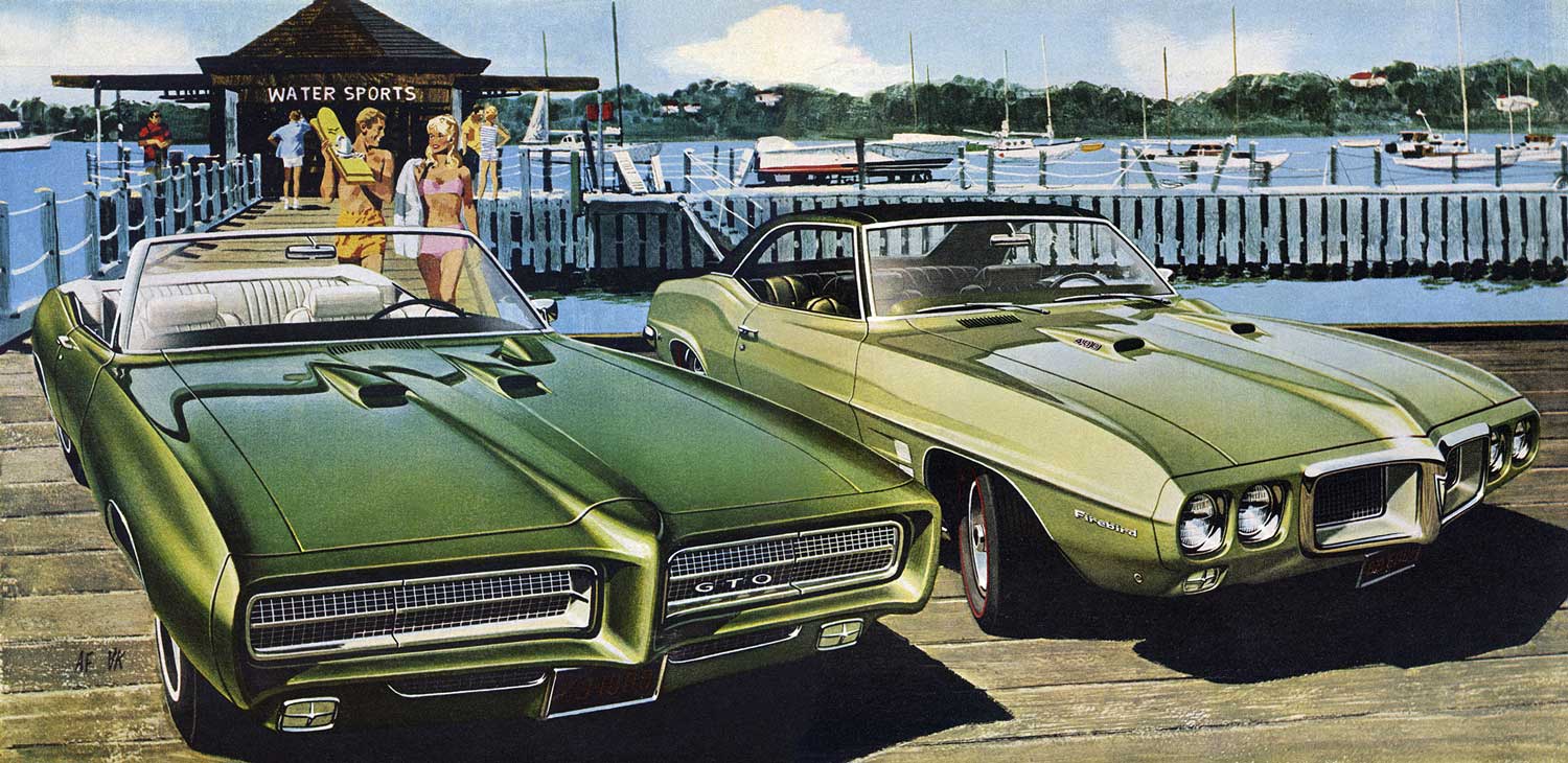
The inspiration for Desert Song (featuring a ’69 Firebird) could have easily been a weekend of fun at Pismo Beach, Glamis, or any number of Southern California hot spots.
An interview with Art Fitzpatrick: Original Mad Man
Written by Influx Magazine
Art Fitzpatrick created in his work for the advertising campaigns of American car companies some of the key images of the chrome-clad dream of the American automobile. Influx caught up with an irrepressible artist who helped define the way that the post war motorcar was created and consumed – now entering his tenth creative decade while the American auto industry shudders from the closure of one of the brands he helped create: Pontiac.
Influx Magazine: Your work seems to encapsulate American dreams of affluence and success as represented by the motorcar. How conscious were you when you were creating the work that you were selling the American Dream?
Art Fitzpatrick: I can’t remember when the “American Dream” became a capitalized term, but I don’t recall it ever being used in any business meeting that I attended. However, what we were doing was just that, selling it. I was always conscious of it. I’m a born firm believer that image is the primary factor in the purchase of an automobile, and every piece of evidence; research, anecdotal, or historical, reinforces my conviction. You’ll never see smoking tires in my ads! An occasional car in motion, but no smoking tires.
IM: What was the commissioning process?
AF: Up until my 1953 contract with Buick, I used an agent … the commissioning process was my getting orders for car paintings through my agent. For the next 20 years the commissioning for each piece of art work consisted of my being told individually, or by a list, of single or double page ads, and what model car (Bonneville (sedan, convertible, wagon) Grand Prix, Tempest, etc.). Colour and view of car, scene, activity, night or day, etc. was left up to me. Once in a while some ambitious copywriter would offer a truly helpful suggestion, like spelunking (cave exploration!!!), which I would either ignore, or if really flabbergasted, caustically comment on.
IM: How tight a brief did you receive from the manufacturers?
AF: None, other than to be technically correct, although I understood that, knowing my work would be reviewed after completion for technical accuracy, like having the proper number of headlights, or “streamline the keyhole cover”. I forgot, the brief from S.E. “Bunkie” Knudsen at Pontiac was basically to transform their image from that of a “3rd grade school teacher’s car” to one that was “socially acceptable”. It went from 7th place in sales to 3rd place in less than 2 years.
IM: Did you exaggerate the dimensions of the cars you were drawing?
AF: I prefer to use the term “enhanced”. I once wrote a piece for GM (when “Truth in Advertising” became a concern of the U.S. Senate) on this subject. I photographed a car … same position/view with 3 different lenses, 35, 50, and 120mm. Photographers, for reasons that continue to escape me, were using long lenses, which shorten a car, making the rear wheel look bigger then the front ones. I always used a 35mm lens (wide angle). I made a pencil line drawing of an exact tracing of 35mm photo, and on another sheet over that did my “enhancing”. Every one it was tested on thought my “exaggerated” drawing looked more like the car than the exact tracing, and way more so than the 120mm lens photo.
IM: Did you visit respective locations you used with the cars and create the work from life?
AF: It’s pretty hard to get a car parked in front of a café in Venice! That’s true of most of our pictures. We shot all the locations then I shot the all of car photos on a turntable from a “cherry picker” bucket at the GM Tech Centre, or in my own driveway. I had company cars, most of the time 3 of them. I only bought (at dealers’ price) 4 cars in my 20 years with GM.
IM: Were you properly compensated for your work?
AF: At the time, we couldn’t believe they were paying us all this money to have so much fun. In retrospect, to paraphrase Automobile Quarterly, ” If, indeed, a picture is worth a thousand words, those illustrations were worth millions to the coffers of General Motors”, now I’d now say we were underpaid!
IM: How would you characterise the changes in the work between the late forties and the seventies?
AF: I’m not sure whether you are asking about my work, or car advertising in general. Mine improved as demand for my services increased my control of the choices of colour, including the cars, the car views, and the subject matter, from no background to complex illustrations. Doing as many as 5 different car ad campaigns at the same time pushed my creativity to make subtle differences in style and technique in how I painted cars.
IM: Do you think there will ever be room again for glamour in the selling of the motorcar?
AF: The title to one of my talks is “What Happened to the Pizzazz?” I deal with the starkly visible difference between what we were doing in 1973 and generally in auto advertising since then. I’m no longer privy to today’s readership research results, but I’d sure like to know what it’s saying, because it has all looked so much alike since then. One of the main reasons for that is the computer, both in the design of the cars, and illustrating them for ads. The photographers put the artists out of business, and the computer put them out of business. The cars all look very much alike on the road, and the ads all look the same on the web, on TV, or in a magazine or newspaper. The ad look is the result of being able to take a car designed on a computer, rotate it to any view desired, and cover it with a grey (read “silver”) skin. So, no photo, no painting, no figures (people), no background (other than some vague, computer generated shape or swoosh). So, no glamour, no class, no emotion of any kind. Recent research says 47% of car shoppers say #1 reason for selection is image, prestige … still by far the largest group, and as for brand loyalty, about that same percentage will leave a dealership and switch to another make if they can’t find the colour they want!
About 15 years ago when Toyota was contemplating a luxury car line they did a tremendous amount of research before picking up a pencil to create a car. They used Mercedes as their benchmark, dissecting both the car and its customers. #1 reason by far for buying … image, prestige … #4 was performance.
Their history book for what became Lexus doesn’t bother stating what #2 & #3 reasons were. The fact that they didn’t bother to mention them is as interesting as their identity and rank. So unless we are all reduced (for whatever reasons) to driving Smart cars, yes, there has to be room for glamour.

Absolutely the very best.
Those two gents had a tremendous influence on a whole generation of designers. Their work still resonates to this day.
I must concur with Roy’s comment! Wonderful automotive art…
I have this book. It’s everything you’ve all mentioned. And more.
We designers at Ford, when these wonderful illustrations came out each month, would clip them out of the magazines & post them in the studios.
Fabulous artwork of beautifully designed cars and they stimulated us to do better as designers & illustrators.
AF & VK benefitted everybody in the field – GM the most.
When I was a trans student at Art Center, every one of us would watch to see what the newest Fitzpatrick ad looked like. They were inspirational to us, to say the least.
Always exceptional work from both men. I enjoyed the backgrounds very much, they inspired the efforts of many designer sketches.
I read the book from cover to cover, every word. They were, without a doubt, the most influential artists regarding automotive illustration for over a decade. They also did Buicks before Pontiac and then Opels after Pontiac and all GM products in the Corporate presentations.
So much to admire and learn from them as to be seen in the work that they did. At Pontiac they asked for and were given free marketing reign, they made the presence of a Pontiac part of an affluent lifestyle. So to buy one was to arrive. No other car company had such an overt declaration tht ppealed to such a large market. Pontiac was highly admired, the design excellence aligned with the advertising excellence and pontiac zoomed to third place in sales behind Chevrolet and Ford. Ford design even tried some Pontiac themes, the reverse of what it should have been.
I made my comments above before reading this article.
In my opinion, Art Fitzpatrick is dead wrong about the use of computers in the design process. The computer does not put artistic content into a vehicle. If little is put in then little is present. I see those cars. Designers can still, if they are confident, experienced and skillful enough express their personal artistic and design character, like a painter, into the design of a car using a computer to manage criteria. See the current Chevrolet Malibu as an example that I have chosen. It is an admirable piece of sculpture without depending upon exaggerated proportion, huge wheels and tires etc. Therefore I see it as a significant design achievement.
A computer can be programed to include the artistic character as expressed by an artist/designer. If he would have the opportunity to choose to do that.
Unfortunately today, very few designers are skillful enough to do enough work in clay to actually understand, recognize and accomplish what they can identify as their own style. As a painter would eventually define a repeatable style. And also logically and aesthetically repeat and develop it.
The studio systems around the world today propogate this design problem.
I do not even know if any of todays designers would even think about. I know that most in the past would not. A well run and experienced, as a team, studio staff has a culture and an unwriten language that defines the way things are done, the way the leader wants them to be done. It takes a little time to develop in a group setting.
After all, it is a billion dollar operation to create a modern motorcar program that will be sold worldwide. More money on one project than spent by the entire motion picture industry in a whole year. The design is in the hands of a dozen designers and their support system. They shouldn’t
even think about it as I was told by Hank Haga in the 1980s when I removed the brushed face from the Chevrolet chrome nameplates. Chevrolet was delighted as that one change made them over a million dollars a year. It is too big to think about, you just have to do the job you were chosen to do.
Computers are a big help but designers today have artistic control and I do not believe that they just go the easy way.
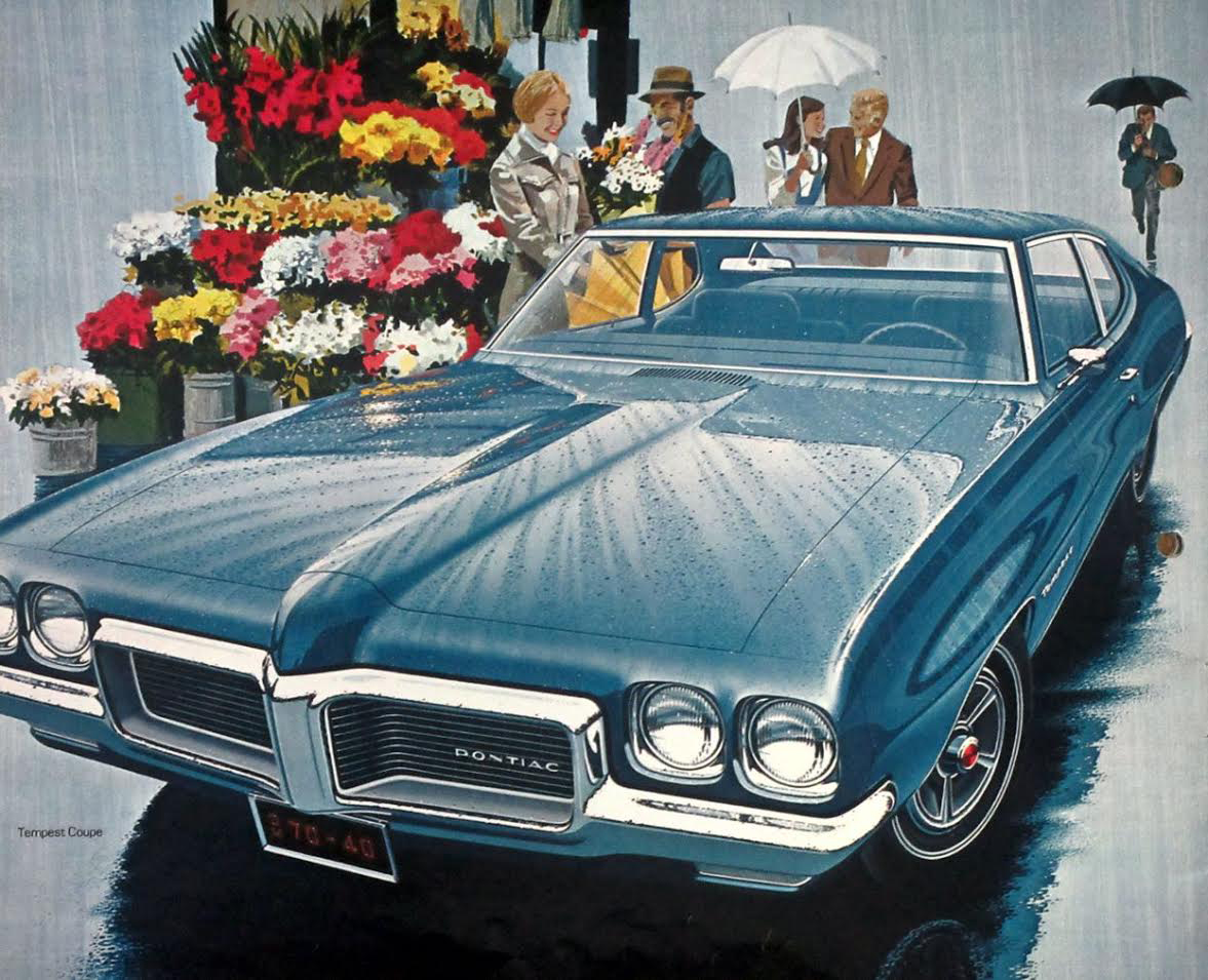
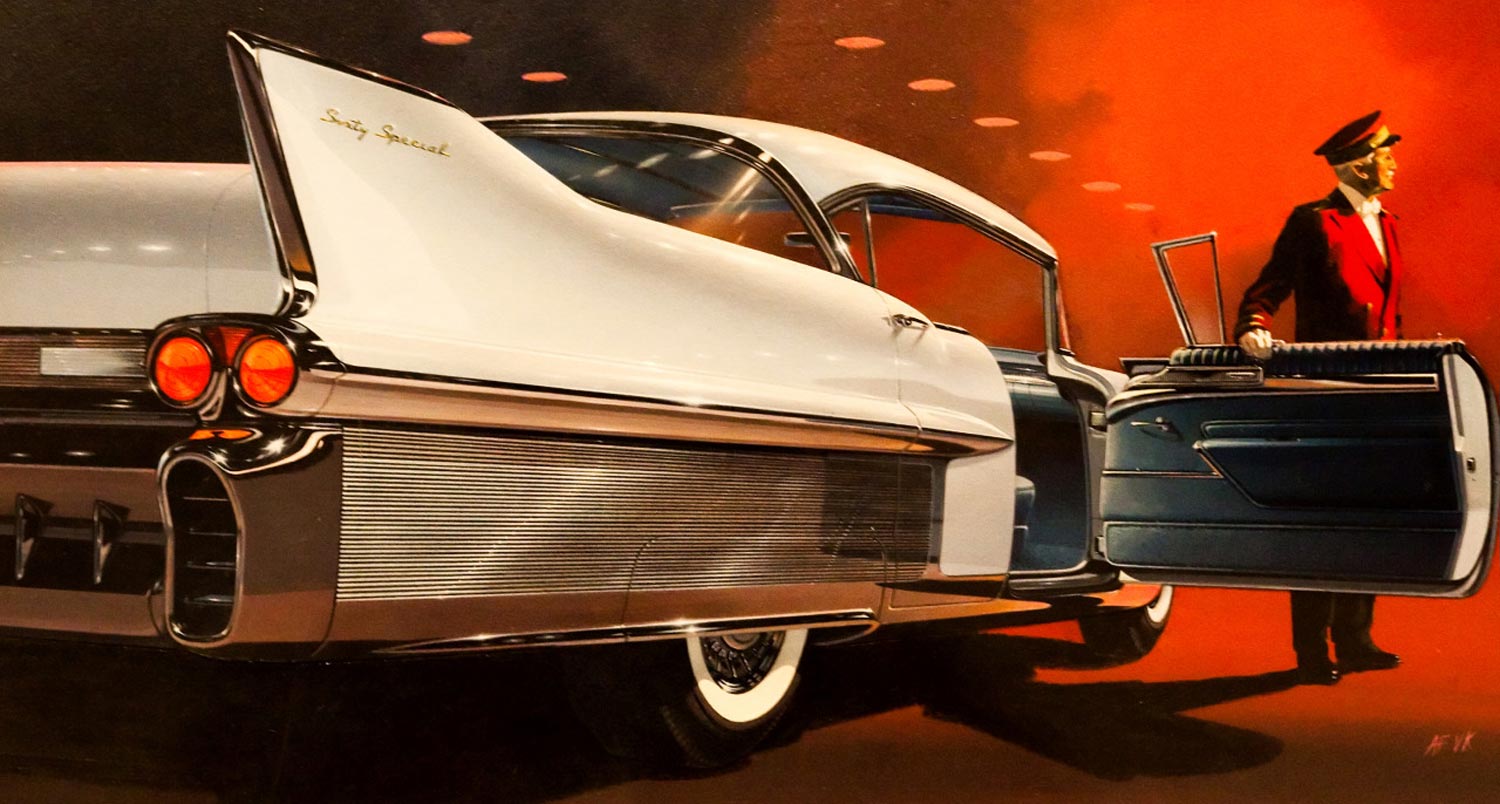
Outstanding !!! No one has even come close to capturing the essence of the automobile as well as those Fitzpatrick & Kaufman illustrations. They still thrill plus they surely played a huge role in the success of the Pontiac brand/image. Dont recall the Caddy illustration, it was breathtaking but I do remember vividly the famous ” Rain scene!”. Thanks for this one!
These magnificent Pontiac illustrations were as sought after as were the works of Syd Mead by we humble lil ACCD students in the early 70s! Talk about perfect composition and superb use of chroma, value, warm/cool……….just the BEST!!
One could learn so much by studying each ad illustration. 🙂 DFO
Glad people are enjoying the video. For more info on the book visit http://www.FitzAndVan.com
Most of the comments have been about Fitz and Van (including my own). But I forgot previously to comment on the fantastic book written by Rob Keil. I bought the book the first day it was released. It resides on my desk next to my workstation. I refer to it daily. It is well written, well designed, and well edited. It belongs in everyone’s design library.
I encourage the reader to purchase as soon as possible.
Great job Rob.
Van created around 100 combat insignia at the Disney studio before he enlisted. I collect Disney WW II related items and have many examples. He left the studio during the war and served in the First Motion Picture Unit, where he helped make training films for the military.